

When creating charts in React, Recharts is a simple and powerful library, but using it with API-fetched data requires some additional steps. You need to process the data in real time, transform it into the appropriate format, and visualize it effectively.
In this article, we will implement a Pie Chart using Recharts and display data retrieved from an API.
By leveraging the map function, we will focus on handling dynamic data instead of static data, providing a more practical example.
- “I can create charts with Recharts, but I’m unsure how to integrate API data properly.”
- “I want to transform the received data before using it in Recharts.”
If you’ve had these thoughts, this guide will help you smoothly visualize API data using Recharts.
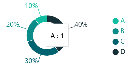
Pie Chart Example: How the Final Chart Will Look in Recharts
Before diving into the implementation, let’s take a look at the final pie chart.
This chart is built using Recharts and visualizes data fetched from an API.
By understanding the final output, it will be easier to follow the upcoming sections on data structure and chart rendering.
Data Format Retrieved from the API
This chart is rendered based on data retrieved from an API.
First, let’s take a look at the data format.
This JSON data is designed to handle value changes flexibly, and in the next section, we will implement a program to process it dynamically.
If you want to learn more about how to generate this data using Django REST Framework, check out this article:
👉 How to Serve Data for Recharts Pie Charts with Django REST Framework“
{
    Data: [
      { name: "A", color: "#13bda2", value: 1, label: "10%" },
      { name: "B", color: "#0c8c88", value: 2, label: "20%" },
      { name: "C", color: "#016370", value: 3, label: "30%" },
      { name: "D", color: "#173037", value: 4, label: "40%" },
    ],
  };
Code Breakdown: Rendering a Pie Chart with Recharts
In the previous section, we examined the JSON data format used for rendering the pie chart.
Now, we’ll implement the code to visualize that data using Recharts.
This code processes the data appropriately and renders a fully responsive pie chart.
Before diving into the details, let’s briefly outline the overall process.
Process Overview:
- Prepare the chart data
- Create a function to display labels
- Set up the
PieChartcomponent - Render the pie chart using the
Piecomponent - Apply colors to each data segment
Now that we understand the overall flow, let’s go through the code in detail.
import React from "react";
import {
  PieChart,
  Tooltip,
  Pie,
  Legend,
  Cell,
  ResponsiveContainer,
} from "recharts";

// Define the data type
interface PieChartState {
  Data: Array<{
    name: string;   // Category name
    color: string;  // Pie chart color
    value: number;  // Numeric value (e.g., percentage, count)
    label: string;  // Display label (e.g., "10%")
  }>;
}

// Sample Pie Chart component
export default function PieChartSample() {
  // Static data for the pie chart
  const chartData: PieChartState = {
    Data: [
      { name: "A", color: "#13bda2", value: 1, label: "10%" },
      { name: "B", color: "#0c8c88", value: 2, label: "20%" },
      { name: "C", color: "#016370", value: 3, label: "30%" },
      { name: "D", color: "#173037", value: 4, label: "40%" },
    ],
  };

  // Function to display labels for the pie chart
  const renderLabel = (entry: { name: string; value: number; label: string }) => entry.label;

  return (
    // Responsive container to make the chart adaptable to different screen sizes
    <ResponsiveContainer width="100%" height="100%">
      {/* Pie Chart component. Adjust margin to prevent label cutoff*/}
      <PieChart margin={{ top: 30, left: 40, tight: 40, bottom: 30 }}>
        {/* Tooltip appears when hovering over data points */}
        <Tooltip />

        {/* Legend positioned on the right side */}
        <Legend
          layout="vertical"
          verticalAlign="middle"
          align="right"
          wrapperStyle={{ fontSize: "0.7em" }} // Adjust font size
        />

        {/* Pie chart configuration */}
        <Pie
          data={chartData.Data} // Assign the data to be displayed
          dataKey="value" // Specify the key used for the pie chart values
          cx="50%" // Set the horizontal center position (X-axis)
          cy="50%" // Set the vertical center position (Y-axis)
          startAngle={-270} // Adjust the starting position (counterclockwise)
          innerRadius={"60%"} // Inner radius (creates a donut chart effect)
          outerRadius={"90%"} // Outer radius
          label={renderLabel} // Display labels for each data segment
        >
          {/* Assign colors to each data segment */}
          {chartData.Data.map((entry, index) => (
            <Cell key={`cell-${index}`} fill={entry.color} />
          ))}
        </Pie>
      </PieChart>
    </ResponsiveContainer>
  );
}
In this article, we explored how to visualize API-fetched data as a pie chart using Recharts.
By understanding the process from receiving data to rendering the chart, you should now have a clear picture of how to implement it in your own projects.
Recharts is a simple yet highly customizable library, making it a great tool for data visualization.
Building on this implementation, you can further enhance your charts by customizing labels, adding animations, or experimenting with different styles.
I’ll be sharing more insights on data visualization using React × Recharts, so stay tuned for future updates!