

Many Django REST framework tutorials cover basic JSON responses, but they often overlook how to structure and format data specifically for charts.
In this article, we’ll explore how to transform raw database entries into a well-structured JSON response optimized for Recharts, a popular charting library for React.
Through sample code, you’ll learn how to generate data for a pie chart and ensure it integrates seamlessly with Recharts.
This version improves readability, enhances flow, and emphasizes the key points more clearly. Let me know if you’d like any further refinements! 🚀
Database Model (models.py)
Here’s an example of how the data is stored in the database before being processed:
from django.db import models

class testData(models.Model):
    type = models.CharField(max_length=255, blank=True, null=True)
    ItemName = models.CharField(max_length=255, blank=True, null=True)
    category = models.CharField(max_length=255, blank=True, null=True)
    ItemNum = models.IntegerField(blank=True, null=True)
    ItemColor = models.CharField(max_length=255, blank=True, null=True)
    baseDate = models.DateField(blank=True, null=True)

    class Meta:
        maneged = False
        db_table = 'testData'

    objects = models.Manager()
Sample Data in the Database
| id | type | ItemName | category | ItemNum | ItemColor | baseDate |
| 1 | α | A | 1 | 1 | #13bda2 | 2025-01-01 |
| 2 | α | B | 1 | 1 | #0c8c88 | 2025-01-01 |
| 3 | β | B | 1 | 1 | #0c8c88 | 2025-01-01 |
| 4 | α | C | 1 | 1 | #016370 | 2025-01-01 |
| 5 | β | C | 1 | 2 | #016370 | 2025-01-01 |
| 6 | α | D | 1 | 4 | #173037 | 2025-01-01 |
Transformed JSON Output
After processing this data in the view, it will be structured as follows:
{
  Data: [
    { name: "A", color: "#13bda2", value: 1, label: "10%" },
    { name: "B", color: "#0c8c88", value: 2, label: "20%" },
    { name: "C", color: "#016370", value: 3, label: "30%" },
    { name: "D", color: "#173037", value: 4, label: "40%" },
  ],
}
We will use this data to generate the following pie chart.
Recharts Pie Chart Image
Now that we have the data, let’s see what the pie chart will look like when rendered with Recharts.
Here’s an example of the output:
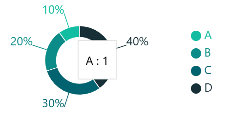
This chart is created using Recharts, a popular charting library for React.
In the next section, we’ll go through the source code to generate the data we defined earlier.
“If you want to learn more about how to render this data as a pie chart using Recharts, check out this article:
👉 How to Implement a Pie Chart Using JSON Data for Data Visualization with React × Recharts“
Source Code (Views.py)
Now that we have an idea of the data structure and the expected output, let’s move on to the implementation.
We’ll create an API endpoint using Django Rest Framework that returns the formatted data required for the pie chart.
In this example, we:
- Retrieve data from the database
- Process and aggregate the data using Pandas
- Format the data into a structure compatible with Recharts
- Return the JSON response
Here’s the full implementation:
from rest_framework.views import APIView
from rest_framework.response import Response
from django_pandas.io import read_frame
from .models import testData

class PieChartAPIView(APIView):
    def get(self, request):
        # Retrieve the queryset
        queryset = testData.objects.all()
        # Convert the queryset into a Pandas DataFrame
        df = read_frame(queryset)

        # Aggregate ItemNum by ItemName and ItemColor
        df = df.groupby(['ItemName', 'ItemColor'])['ItemNum'].sum().reset_index()
        # Rename columns to be compatible with Recharts
        df.columns = ['name', 'color', 'value']

        # Calculate the percentage of each `value` relative to the total and convert to 100% format
        df['label'] = (df['value'] / df['value'].sum()) * 100
        # Round to the nearest whole number
        df['label'] = df['label'].round()

        # Adjust the total to ensure it sums to 100%
        difference = 100 - df['label'].sum()  # Calculate the discrepancy from 100%
        if difference != 0:
            max_idx = df['label'].idxmax()  # Get the index of the largest value
            df.loc[max_idx, 'label'] += difference  # Adjust the largest element by the discrepancy

        # Convert `label` to a string and append "%"
        df['label'] = df['label'].astype(str) + '%'

        # Sort by `value` in ascending order (for better visualization in the pie chart)
        df = df.sort_values('value')

        # Create the API response data
        data = {'Data': []}
        for index, row in df.iterrows():
            # Store each row's data as a dictionary
            data['Data'].append({
                'name': row['name'],  # Item name
                'color': row['color'],  # Color code
                'value': row['value'],  # Value (size of the pie chart segment)
                'label': row['label'],  # Label (percentage display)
            })

        # Return the data as a JSON response
        return Response(data)
Why No Serializer?
Since we are formatting the data manually using Pandas and returning a custom JSON structure, we don’t need Django REST Framework’s Serializer. Instead, we process the data directly in the view.
Setting up the API Endpoint (urls.py)
Now, let’s register this API endpoint in urls.py so we can access it.
from django.urls import path
from . import views

urlpatterns = [
    path('pie-chart/', views.PieChartAPIView.as_view())
]
Now, you can access the data at:http://your-domain.com/myapp/pie-chart/
In this article, we explored how to generate complex data structures for charts using Django REST Framework.
You should now have a better understanding of how to transform database data with pandas and serve it through an API.
Additionally, leveraging pandas significantly reduces the learning curve for Python users when implementing APIs, making it an efficient choice.
I will continue sharing insights on data visualization and API optimization using Django × pandas, so stay tuned for more updates!